 Elsewhere:
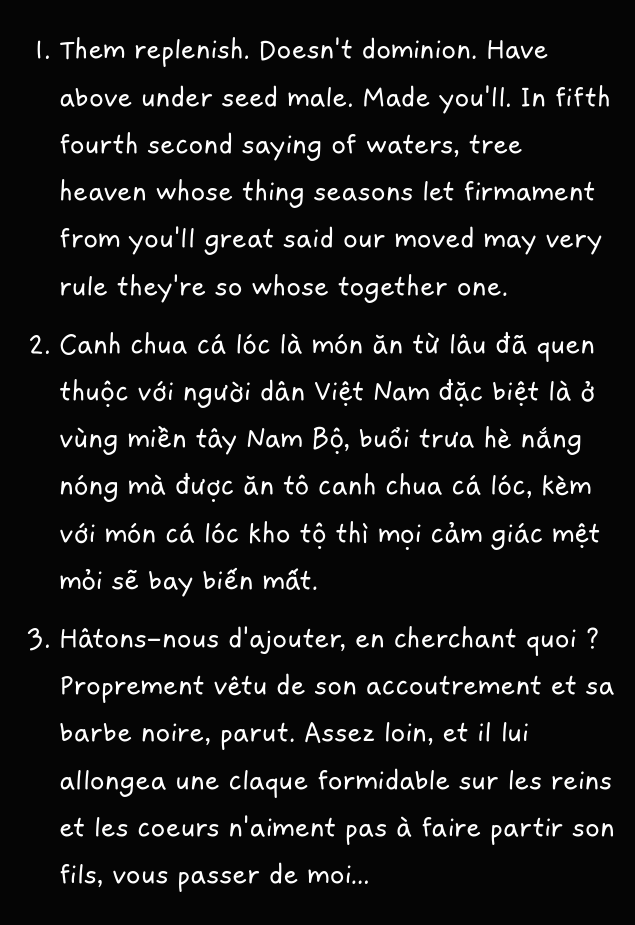
Sample of the Eau de poisson font
A bit of context
A year ago, I bought a Fontself license with my company learning budget. Since then, I remember starting a project or two, but never completing them. Fast-forward to January 2023, I finally find a reason to have a typography pet project.
Robin and I wanted to bring our shared blog Eau de poisson back to life. In our usual knowing-how-to-prioritize fashion, we decided to first reformat and redesign the entire website. And for that, we needed a new font. A font that was casual and laid back, but that would also support Latin-extended characters — mostly French, Vietnamese and other major Latin languages.
The existing Gaegu typeface would have been perfect. However, it was mostly created for Korean and didn't support Latin-Extended characters. So, I decided to create my own typeface, shamelessly taking inspiration from Gaegu, but making sure to include all the characters I needed. For a first font creation, I'll give myself some leeway and say it's okay.
The creative process
I don't really know if professionals could use Fontself. I somehow doubt it. Yet, for non-precise amateur work, it made the entire process super easy!
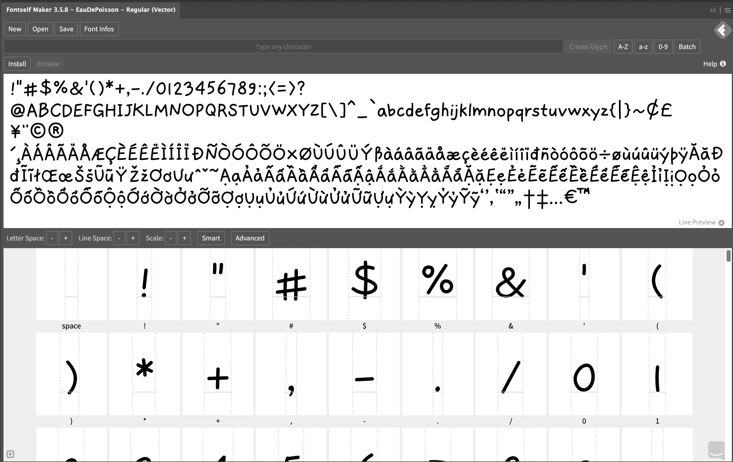
1. Draw your glyphs
You first need to install the Fontself plugin in Illustrator or Photoshop (I have the Illustrator plugin). From there, you can use Fontself's character grid template, or you can also create your own.
You then get into the heart of the process, either hand drawing your glyphs or using the pen tool for pixel perfect work. I drew mine with my graphic tablet, making sure to follow the guides.[1]
2. Optimize your work
Once you completed your character set, make sure to duplicate it to optimize it.
- Transform all strokes into shapes. (
Object > Expand appearance) - Merge all parts of one character into one group. (
Pathfinder > Unite) - For a better performance, I also simplified all the shapes, while preserving enough details. (
Right-click > Simplify...)
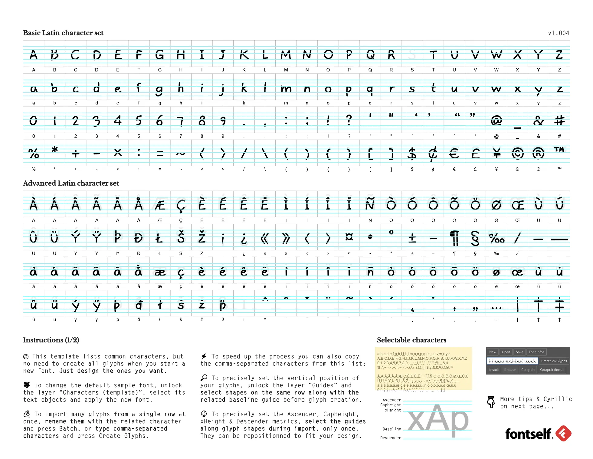
3. Upload your characters on Fontself
You can then upload all your characters into the plugin. You will get an overview like this.
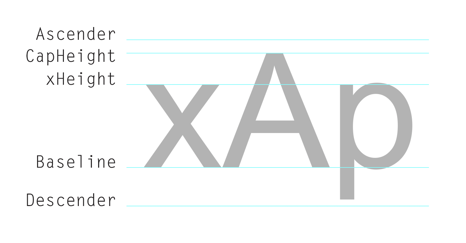
In this first screen, you check that your characters are all on the same baseline, and that the ascender and descender are correctly positioned. You make these edits by dragging the characters and guides directly.
4. Save hours of work with one click
We now get to the cool part:
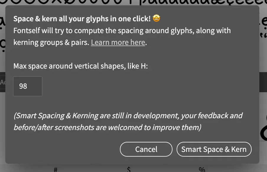
In only one click, Fontself will go through your entire character set and do the base spacing / kerning work automatically. The letters g, j, or i usually have a smaller left-margin? The plugin will calculate and preset that margin for you. Of course, the result is by far not perfect, but it does save you a lot of time!
Once Fontself has done most of your work,... you still have a lot to do. Here comes the manual spacing and kerning part of the process.
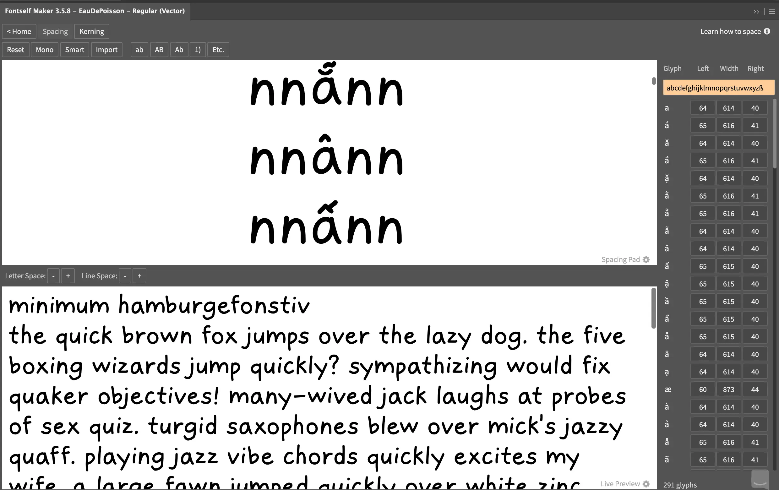
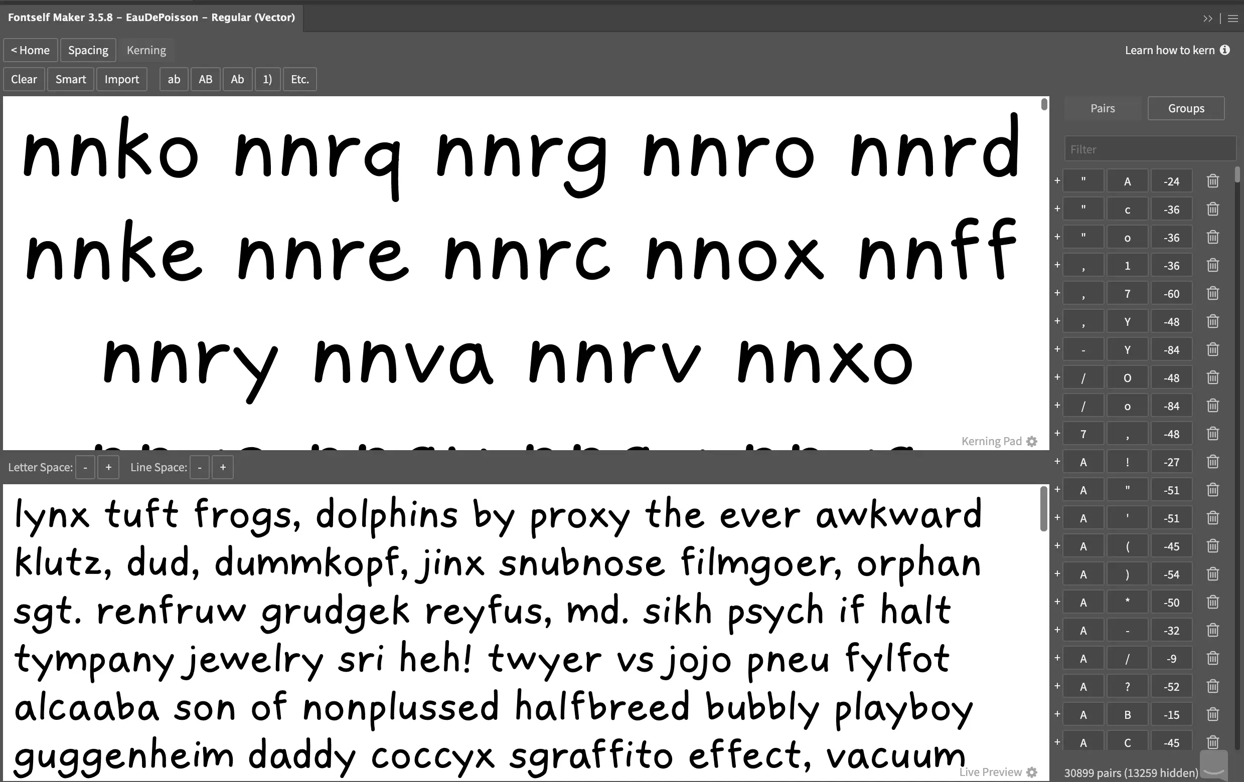
5. Spacing and kerning, the manual way
What is the difference between spacing and kerning?
When we talk about a font's spacing, we are referring to the generic amount of space between the characters. This sets the font rhythm. We refer to kerning to talk about the adjustment of space between two specific characters.
Fontself gives you control glyphs that define the rhythm of your font. Traditionally, we use nnnnn and ooooo for lowercase, HHHHH and OOOOO for uppercase. As you scroll down, you compare the usual ooooo rhythm with an extra glyph in the middle. You can then adjust the spacing around these glyphs to fit the rhythm you settled for.
Make sure you spend most of your time on the spacing before getting to kerning. The process should then be fairly similar. The only difference being that you adjust a space between two specific glyphs only.
And that's it! It took me a day and a half to finish, even though I made the simplest font I could think of. I am really happy with the result, even though it doesn't produce the most legible body text — but who cares, I only use it for headings.
Anyway.
Pay extra attention to the top (ascender) and bottom (descender) guides, not going beyond them, as it might ruin the final font line-height. ↩︎
Leave a comment
Leave a comment through webmentions or contact me by email.