 Elsewhere:
With as little JS as possible Published on digital
I'll use this post as a way to document my implementation of a fully accessible hamburger menu for this website. I tried to keep the design and code as simple as possible, prioritizing CSS over JavaScript.
Note: I am not an expert, so feel free to tell me if you see any improvement opportunity!
No BS design requirements
For the current design of this website, I want to keep things clean and straightforward. This means: solid colors, system fonts, and an overall "no BS vibe".
For the menu section, this translates into a simple menu bar displayed at the top of the page. On desktop, all menu items are listed one after another, no further dropdowns needed.
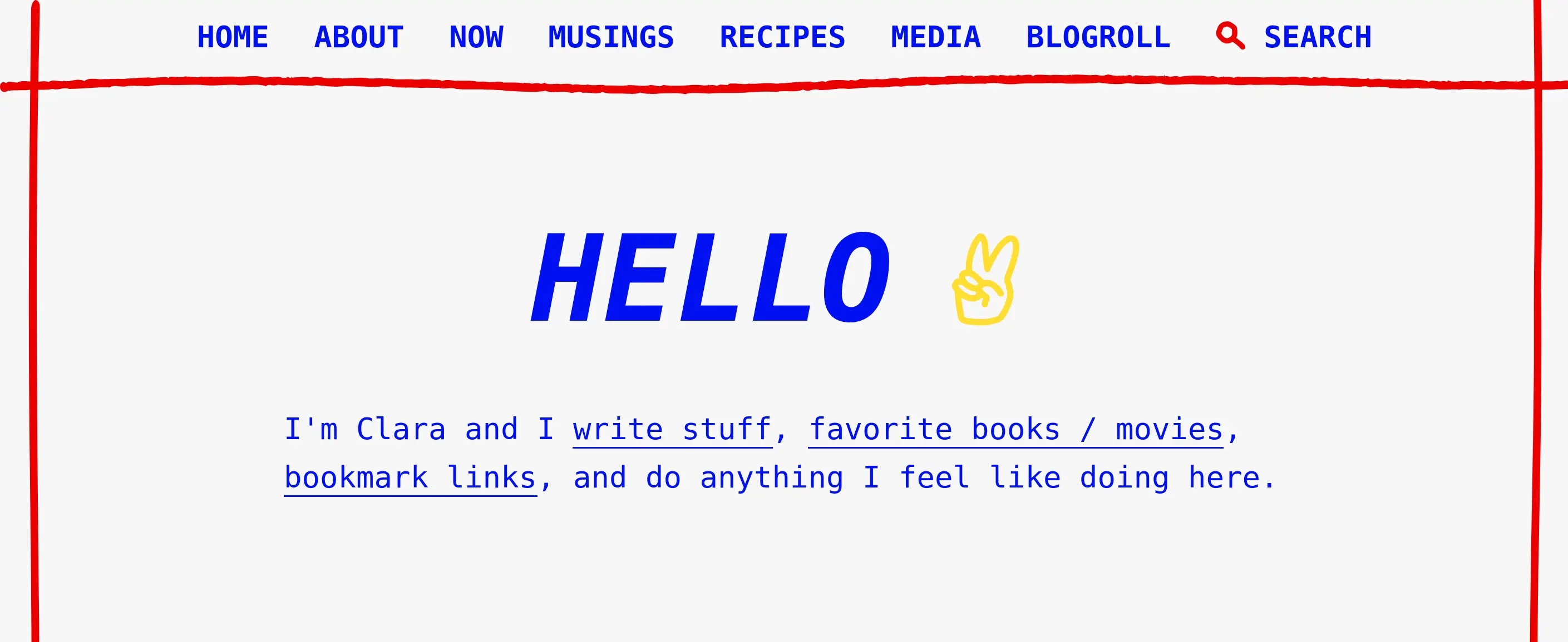
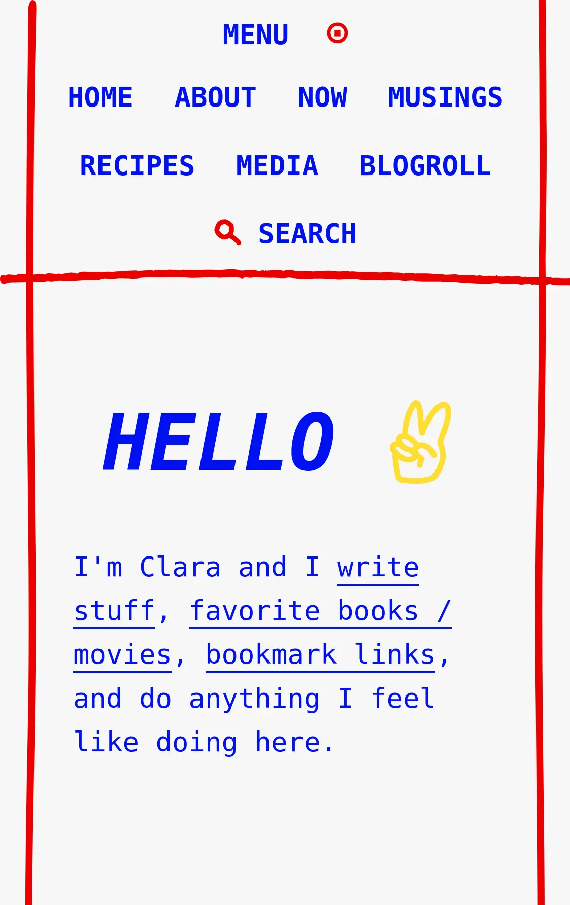
On mobile, displaying the full menu list by default does seem to be visually overwhelming. No need to reinvent the wheel, I chose a classic "hamburger menu" that the user can expand and collapse at will.

Accessibility challenges
From time immemorial, the hamburger menu has been coded again, again and again. Unfortunately, many of the ones we see in the wild are still far from accessible.
Many will not work so well with screen readers, relaying cryptic messages to the user. Some will only work with JavaScript enabled, others won't support keyboard navigation at all.
To circumvent these challenges, I will need to add a bit of JavaScript on top of the HTML and CSS. Let's take a look at the HTML structure first.
HTML structure
The menu HTML code will look like this:
<nav>
  <button id="menu-button" aria-haspopup="true" aria-expanded="false" hidden>
    Menu
  </button>
  <ul id="menu-list">
    <li>
      <a href="/">Home</a>
    </li>
    <li>
      <a href="/about/">About</a>
    </li>
    <li>
      <a href="/now/">Now</a>
    </li>
  </ul>
</nav>
On the highest level, there is a <nav> tag that wraps two children:
- a
<button>calledmenu-buttonthat can be toggled to collapse/expand the menu list - a
<ul>tag calledmenu-list, listing our menu items
Upon closer inspection, we can see that the menu-button has a few ARIA attributes:
- The
aria-haspopupproperty indicates a popup element (such as a menu or dialog) that can be triggered by an element.[1] When set totrue, the popup is defined as a menu. - The
aria-expandedproperty indicates whether an element is collapsed (set tofalse) or expanded (set totrue).
These attributes only come into play when the menu can be interacted with through the hamburger menu. Let's see how this interaction appears in the JavaScript script.
JavaScript
Here is the script that will allow the user to interact with the hamburger menu:
// Select DOM elements
const menuButton = document.querySelector("#menu-button");
const menuList = document.querySelector("#menu-list");

// If JS is enabled:
// 1) unhide menuButton
// 2) on mobile, show menuButton and hide menuList
// 3) on desktop, hide menuButton and show menuList
menuButton.removeAttribute("hidden");
menuButton.classList.add("js-enabled");
menuList.classList.add("js-enabled");

// On click, expand the menu when collapsed, and vice versa
menuButton.addEventListener("click", () => {
  menuButton.ariaExpanded = menuButton.ariaExpanded !== "true";
});
All in all, I tried to take an approach that deprioritizes JavaScript. In other words, it means that if a user doesn't have JS enabled, they will still be able to see the full menu displayed (on both desktop and mobile) without any interaction needed.
With JS disabled, the mobile menu would look like this:

Do you notice the difference with the JS-enabled version? The mobile menu (without JS) looks pretty similar to the desktop version — there is no menu button to interact with.
(In the HTML structure, the menu button has the property hidden by default — which hides it effectively from both screen reader and visual users.)
Now... what if the user has JavaScript enabled? The script would be effectively run, and it would do two things first:
- Remove the
hiddenattribute from the menu button, so that it can be made visible on mobile. (I'll do that through some CSS.) - Add a
js-enabledclass to both the menu button and menu list elements. This class will allow me to style the menu, depending on if the user has JS enabled or not.
Finally, the final addEventLivisiblestener function detects if the menu button is clicked on, and toggles the aria-expanded attribute from true (expanded) to false (collapsed). Screen readers can therefore accurately describe the menu as open or closed.
CSS
At this point, the hamburger menu is not yet usable without a few CSS additions.
/* AESTHETIC STYLES */
nav {
  /* Name and size of container need to be set to use a @container query */
  container: nav / inline-size;
  /* The following centers everything, for both mobile and desktop */
  display: flex;
  flex-direction: column;
  justify-content: center;
  align-items: center;
}
#menu-list {
  text-align: center;
  list-style: none;
  margin: 0 1rem;
  padding: 0;
}
#menu-list li,
#menu-button {
  display: inline-block; /* aligns menu items horizontally */
  margin: 1rem;
}
#menu-button::after {
  content: "\00A0⊙"/ ""; /* adds an icon after the "Menu" button label */
  color: red;
}

/* MENU INTERACTION */
/* If JS is disabled: hide the menu button */
#menu-button:not(.js-enabled) {
  display: none;
}
/* If JS is enabled: hide the menu list by default */
#menu-list.js-enabled {
  display: none;
}
/* If menu is marked as expanded, display the menu list */
#menu-button[aria-expanded="true"] + #menu-list {
  display: inline-block;
}

/* BIGGER SCREENS */
/* Styling children of container named "nav" when width is bigger than 450px */
@container nav (width > 450px) {
  /* Hide the menu button for all users (JS enabled or not) */
  #menu-button {
    display: none;
  }
  /* If JS is enabled, remove the `display: none` style previously set */
  #menu-list.js-enabled {
    display: unset;
  }
}
There is a lot going on here. The first section of the code is only related to aesthetic styles (margins, alignments, etc.). Practically all of it can be optional depending on the final design.
The second section is quite important as it is about the menu interaction. With CSS selectors, I detect if the user has JavaScript enabled (with the js-enabled class) or not, and if the menu has been expanded or collapsed (through the attribute aria-expanded). The menu button and menu list are then hidden or displayed accordingly.
The third section completes the second one, specifying responsive styles "for bigger screens". In this case, I could have used a @media query to achieve the same result. However, I preferred to choose a @container query for a few reasons:
- The navigation menu responsiveness is more closely linked to the element width itself, rather than the viewport width.
- All the CSS related to the navigation menu can be kept in one place.
- The code is more modular/portable.
The final result looks simple: a menu bar for desktop, a hamburger menu for mobile. Adding a few CSS and JavaScript tweaks made sure that screen readers, keyboard users, and no-JavaScript users are also able to navigate the website successfully.
And... that's about it.
More info on the W3C doc about the
aria-haspopupattribute ↩︎
Leave a comment
Leave a comment through webmentions or contact me by email.