 Elsewhere:
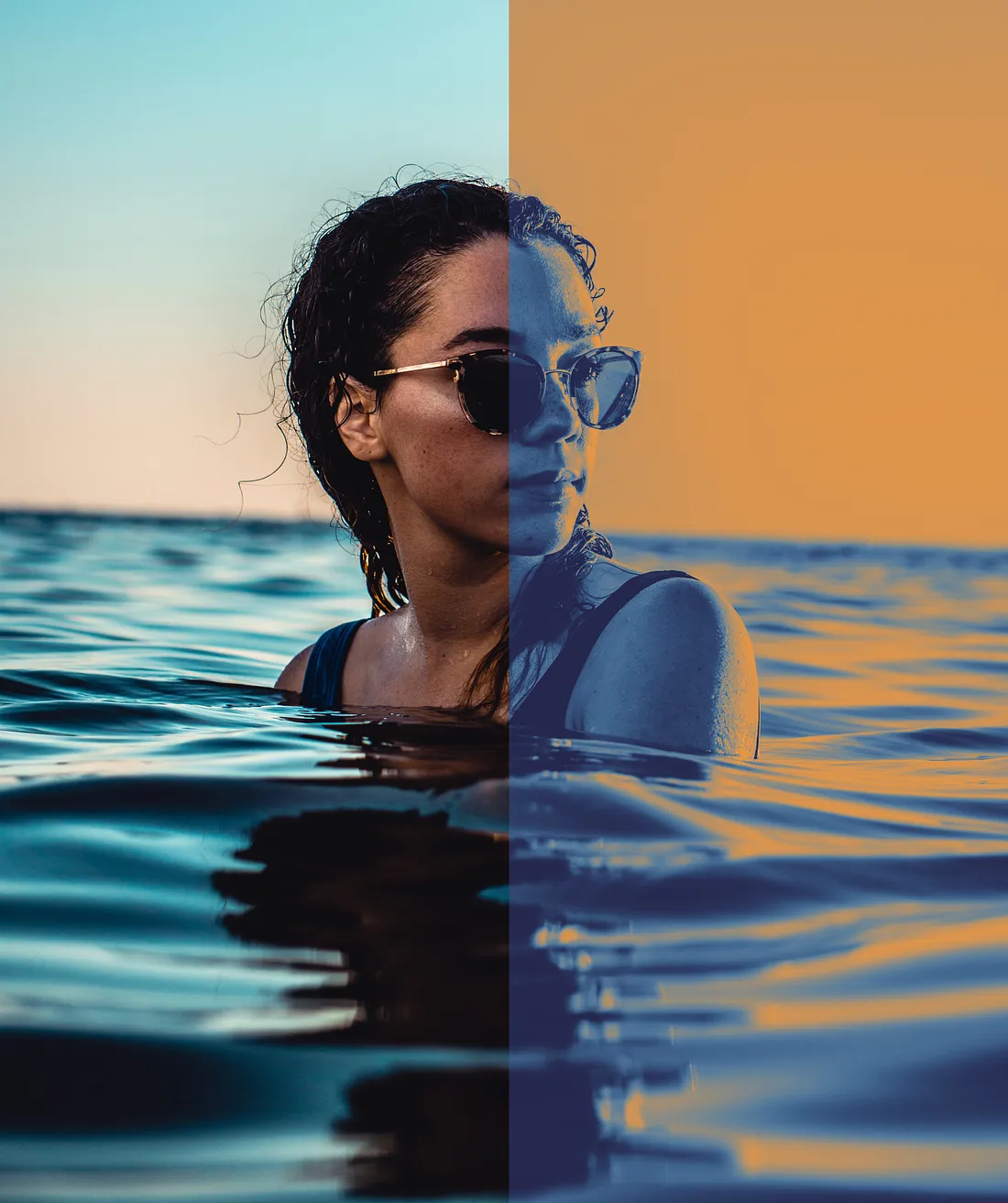
There is a new kid in town and its name is duotone.
You've certainly seen that refreshing effect used more than once this past year. The duotone effect consists of combining two contrasting colors in your image — one color for the dark tones and one color for the light tones.
You can easily use this effect to strengthen a brand visual identity based on a few colors and get a vibrant result.
Let's get started! 🚀
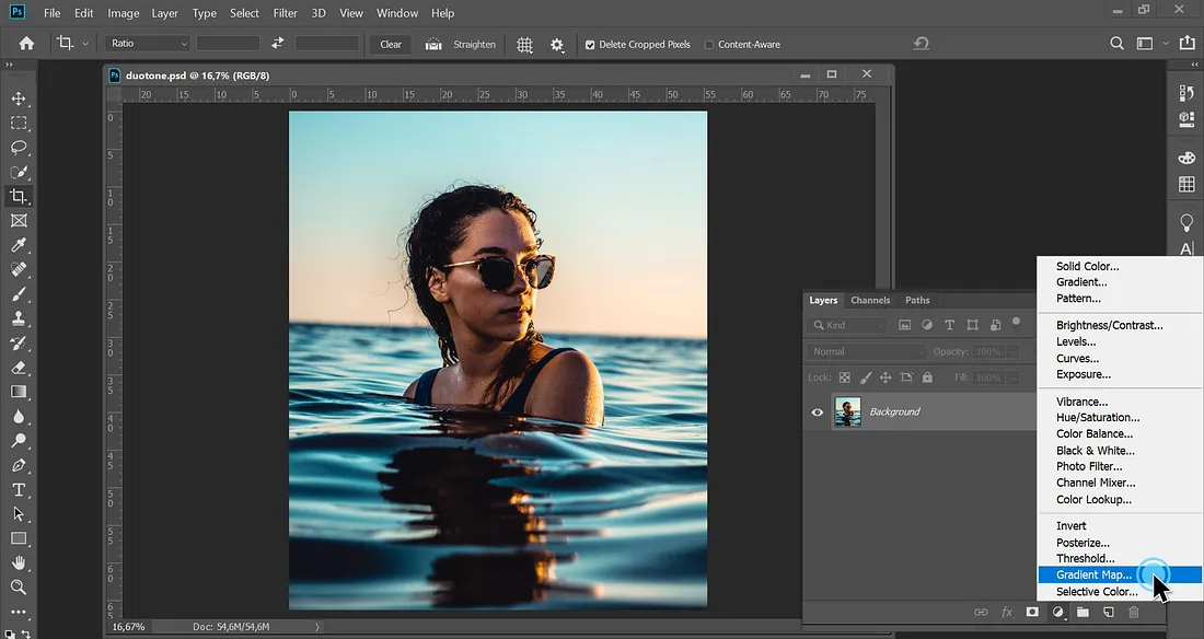
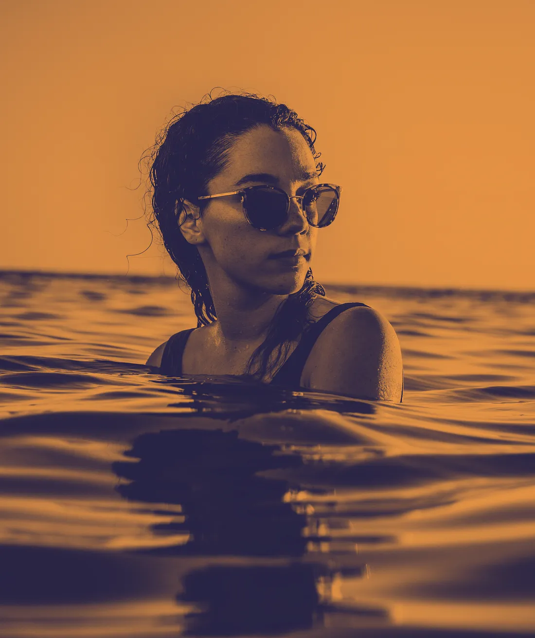
Step 1
Choose a super cool image and open the Layers panel (Window > Layers). Click on the Adjustment Layer icon — the black and white circle thingy — and select Gradient Map…
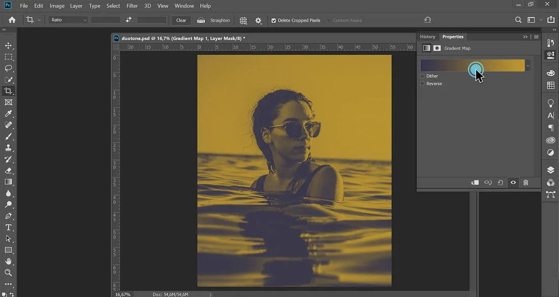
Step 2
A gradient preview appears, click on it to open the Gradient Editor. (The default gradient looks okay, but meh, it would just be waaay too easy 😘)
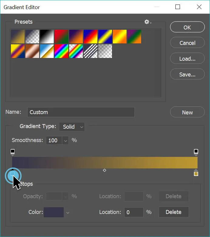
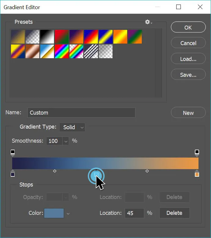
Step 3
Here comes the fun part. Double-click on the left Color Stop to change its color. Do the same for the right Color Stop.
- By default, the left Color Stop replaces the dark tones of your picture 🕶
- The right Color Stop replaces the light tones ☀
Feel free to move the stops around to control the color distribution 🎨
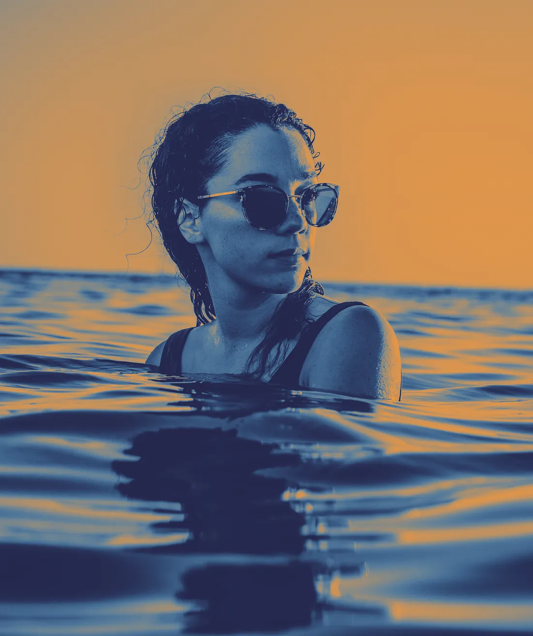
And here is your duotone image! 🎉
Step 4 (Optional)
Wanna get a bit crazy and go triotone? Add additional Color Stops to your gradient by clicking right underneath it.
In this example, I've added a lighter blue in the middle of my gradient to give more definition to my picture.
You did it! 💁♀️
Leave a comment
Leave a comment through webmentions or contact me by email.