 Elsewhere:
I made them too and will probably make them again Published on creative
If you are an innocent graphic designer (a.k.a. mostly used to the web), print design might seem like a super scary and intimidating world. It is.
When designing for print, you are bound to make mistakes as a beginner. There are just too many things to think about. But don't fret. The world of print design is also fascinating and deeply satisfying — just imagine holding your freshly printed [insert your project name] 😍
Get started, experiment, and welcome to the world of print design! (But try to avoid these mistakes if you can… 🤞)
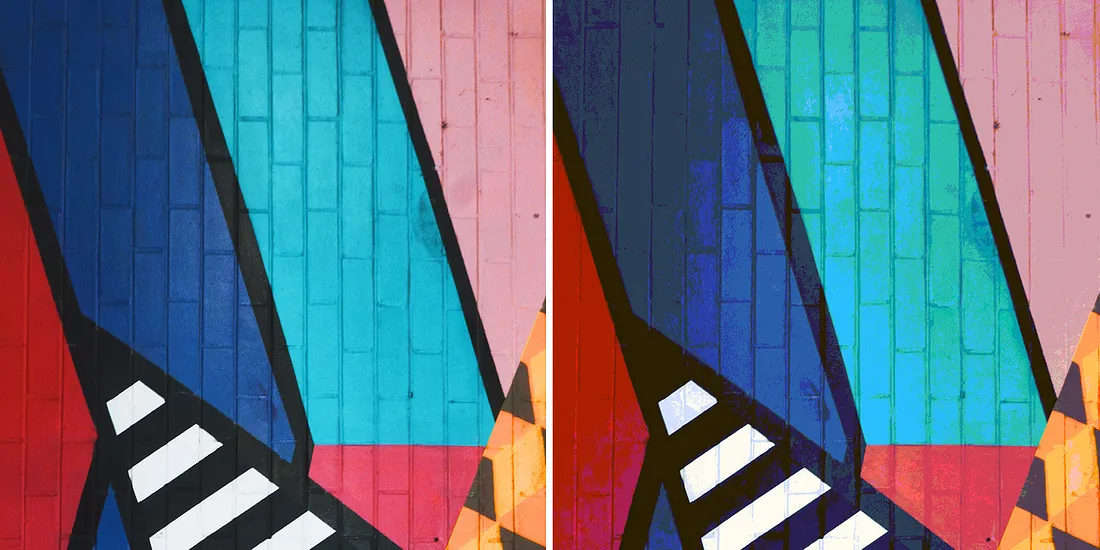
1. Don't use RGB colors, design in CMYK.
The RGB colors you've been using (almost) all your life on screen are based on light. Red, Green and Blue lights are added together to reproduce other colors.
However, your printer is much more limited and won't be able to reproduce all the colors you see on screen. It's because it has to mix the four CMYK inks (Cyan, Magenta, Yellow and Key) to obtain a new color.
So what?
Make sure to select the CMYK color mode, when creating your artwork. And if possible, always base your color decisions on a physical CMYK or Pantone color chart.
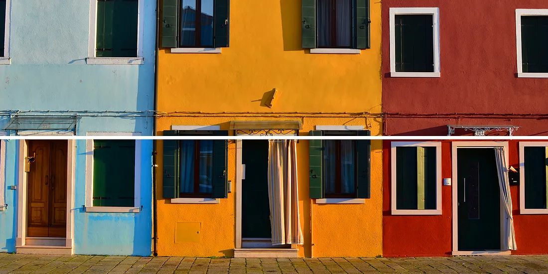
2. Your images resolution is too low.
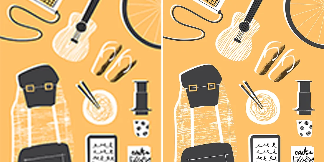
Simply inserting "this super cool image you found on the web" into your print design can often lead to disaster. If you don't want to get a very pixelated result, your image resolution should always be between 300 ppi (pixels per inch) and 400 ppi.
So what?
Even if the image quality seems to look good on screen, it might not be the case in print. Always check that your artwork resolution is above the 300 ppi threshold.
3. You haven't thought about the bleed and quiet borders.
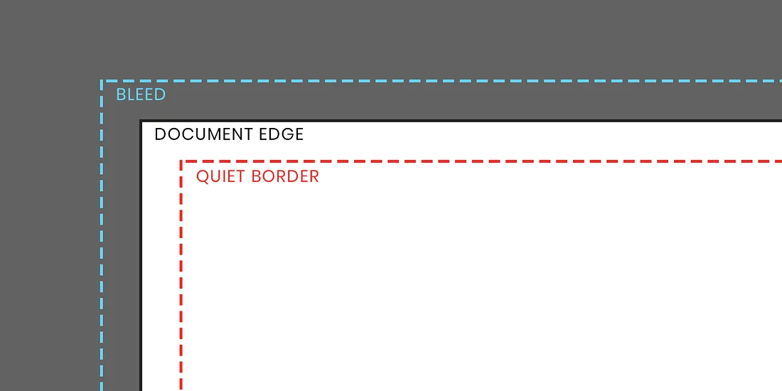
Need to print to the border very edge?
Set up a bleed before creating your design. The bleed is an outer-margin that you set around your document borders. All the graphics that touch the borders will be slightly extended to the bleed limit, before being trimmed to the sheet size after print. Thanks to the bleed, you won't have any unwanted white border appearing along the edges of the artwork.
The quiet border is a safety margin inside your document, where no essential elements — such as text or logo — should be placed. This border is necessary as the trimming process is not always precise and can cut off important information.
So what?
Set up a bleed of 3–5 mm and a quiet border of 10–15 mm for a regular A4 paper.
These limits should be adjusted to your printer and paper size. As a rule of thumb, the bigger the sheet, the wider the bleed / quiet border.
4. You don't really know how to use black.
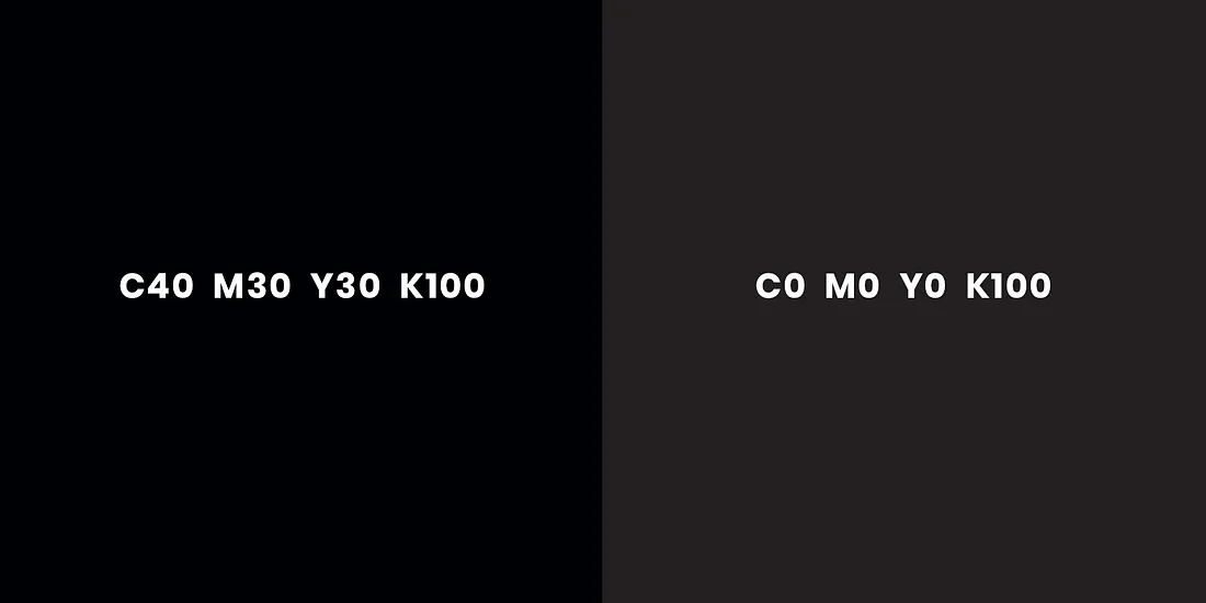
You are writing down your copy, selecting black ⬛ as a text fill color and are ready to print! Well, maybe not.
Double-click on the black fill you used and check the CMYK code. It might be something like C75-M68-Y67-K90. Using all four inks to write in black can result in blurry text — and that's bad. What you really need is to use the following code: C0-M0-Y0-K100.
However, when applied on a larger area that black tone will look almost grey. For best results, switch to a rich black by mixing several ink colors to get a darker tone. There is not one recipe, but try to use the C40-M30-Y30-K100 CMYK code for those large areas.
So what?
Use a crisp black C0-M0-Y0-K100 for small text, and a rich black for large black areas C40-M30-Y30-K100. If possible, directly check with your printer what their specifications for rich black are.
5. Your characters are too thin.
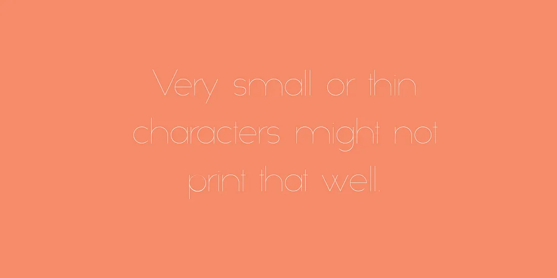
Depending on your printer capacities, your very small and thin characters might not be printed at all. So be careful with fine hairlines and tiny text!
Another common mistake is to use small text on a rich black background. The slight misalignment of printing plates might make your characters illegible. When you have white text over black, use a C0-M0-Y0-K100 simple black to avoid this possible blur 🏃♂️🏃♂️🏃♂️
So what?
Don't use tiny text in your artwork. 6pt character size is a good rule of thumb — even though it all depends on your typeface style!
When using small white text over black, choose a C0-M0-Y0-K100 simple black.
6. Haven't proofread your file?
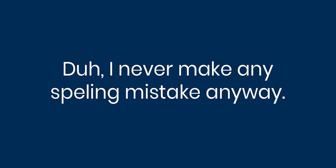
Yes, proofreading is boring.
It is so easy to publish a blog post, notice a typo, and correct it afterwards. However, spelling mistakes are the worst in print design. When printing hundreds of posters, that small typo reproduced over and over again might not seem so trivial anymore 😨
So what?
Always and systematically proofread and review your artwork before sending it to the printer. As a designer, also check for spelling mistakes and typos even if you haven’t written the original copy.
7. You haven’t embedded your graphics and text.
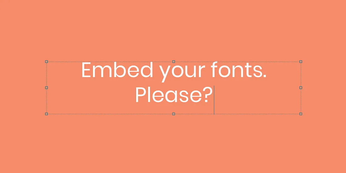
Your artwork is looking good and ready for print. You are especially happy about this super fancy font that you’ve found on Creative Market! 💁♀️
Just sending your design for print (even in PDF format) is not always a good idea. In all probability, the printers you are working with won’t have that fancy font and some problems might occur — some characters might be replaced, or disappear altogether.
Make sure to embed all fonts in your artwork, before sending it to your printer. Outlining any stroke in your artwork to convert them into shapes and flattening all your work layers are also good practices.
So what?
Don’t forget to embed your fonts, outline your artwork strokes and flatten your layers.
8. You forgot about ink coverage.
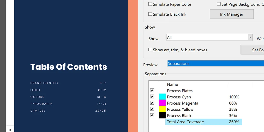
To print an artwork using CMYK colors, your printer will use four plates of inks that combined together in dot patterns will make up an image.
Your printer and paper will often have an ink coverage limit. For example, let’s say you apply a rich black C70-M70-Y70-K100 on a large area. That area ink coverage would amount to 70+70+70+100=310%.
Most standard printers can handle an ink coverage of 260%. Going over this limit can result in quality problems and warped paper.
So what?
Check with your printer what their ink coverage is, and make sure that the colors you use fit this limit.
9. You’ve been using the wrong format.
Are you about to export your artwork into PNG or GIF files for print? 😱
These formats were developed for screen only. They have a resolution that is too low for print, as well as a reduced color capacity.
So what?
For best results, export your file into a PDF format before sending it to your printer.
10. You thought a hard-copy proof wasn’t necessary.
Getting a hard-copy proof from your printer is not always necessary. But the bigger your project is, the more critical it becomes to see a physical example of your work before printing 10,000 other copies.
Also make sure to use your printer color chart if they have one!
So what?
Get a hard-copy proof of your work and check with your client that everything is perfect before scaling up.
Alright, you now know the basics and are ready to go — all by yourself 🤧
Do your best
Leave a comment
Leave a comment through webmentions or contact me by email.